INTRODUCTION
OOOH.TV
social media and creator platform
Oooh was a social network that combined interactive content and gaming to make social media engaging instead of passive. Think TikTok meets gaming: creators and friend groups hosted playable challenges. As the sole product designer on discovery and systems, I redesigned how people found and picked a game, then turned those patterns into a shared Figma library the team built from without me.


 →


Use Left and Right arrow keys to browse; Home and End reach the first and last items. You can also swipe or drag.
Entry Point, View All and What’s Hot, adapted from my Host Discover View handoff, Oct 2022, alongside a discovery exploration.
ただ眺めるだけじゃなく、一緒に遊べて、気持ちよく過ごせるソーシャルメディアを作りたい。
- WHAT
A Series A social game and creator platform. We launched it globally out of beta in 2022 to 10,000 creators, who signed up through our creator site.
編集を支えるデザインシステムも、ブンブン動くように作った。
- ROLE
Senior Product Designer
About 6 min read
- SCOPE
Product design, design systems
検索する言葉が浮かばなくても、見ているうちに「これ、やってみたい」が見つかるといい。
Making the next game easier to find
At an all-hands after VidCon 2022, one observation kept coming up: first-time users scrolled the thumbnail wall instead of tapping into a game. Too many games, no way to tell them apart. The paradox of choice turned into analysis paralysis.
The old catalog showed posters, play counts and rewards, but not what you did in a game. My job was everything leading into a game; other teams owned gameplay and recording.
My role
I joined Oooh.tv as Senior Product Designer in May 2022, working with the founders, our Design Director, three PMs and our game studio. As the sole designer on these surfaces, I owned six connected parts end to end: host onboarding, discovery, the shared Figma library, the creator site and earnings portal, web-to-app previews, and post-round reactions.
How I worked across the studio
Between the studio and the product
Working across the weekly game studio and core product let me design at the seam between content and UI: shaping card rules so weekly game art never broke the feed, and building web previews so links shared on Instagram or Twitch dropped fans straight into the round. In my first week, I also designed our VidCon and TwitchCon booths and the pink Oooh claw machine.
Teach people how to host
New hosts didn’t need a directory on day one; they needed a first round that taught the loop. I pinned three pink Get Started cards above the catalog for different comfort levels: Q&A for camera-shy players, a face-tracking game like K-Beat, and a rotating studio release.
Colin, our founder, was dead set on making those three a gated checklist in the discovery view. I advocated against the gate and brought a compromise with evidence behind it: in intern critiques and test sessions, gatekeeping caused tension. Interns clicked around trying to escape it, and first-time testers wanted to explore, not finish a checklist. The cost: a new player could skip the lesson, so every card had to explain its own game.
 InfoBring Your Own BeatCreate your own beat, and let others mix and match theirs with yours.
 + 25 HostsUse
 InfoHead Above WaterHow long can you keep screaming into your mic to stay afloat?!+ 1.2k HostsUse
 InfoK-BeatA fun rhythm music game+ 25.5k HostsUseWhat’s Hot 🔥See All
 InfoQ&AAn Oooh template that allows you to interact with your community in a Q&A format.+ 100 HostsUseInfoHead Above WaterHow long can you keep screaming into your mic to stay afloat?!+ 100 HostsUse
Redefining the editorialization
Once someone scrolled past Get Started, the feed had to let them preview a category or jump into a trending list without losing their place. I connected Entry Point, View All, and What’s Hot into a single loop so switching categories took one chip tap.
- Entry PointSee All lands on its category
- View AllChips switch category
- What’s HotBack returns to Entry
Handoff design, Host Discover View, Oct 2022. The chip tap is inferred from the handoff’s chip states, game descriptions match their templates and counts are handoff design samples.
Make discovery worth browsing
Oooh’s catalog never sat still: games rotated in and out and seasonal events came and went. I put search and category chips at the top, with featured, trending and limited-time drops right below.
The detail I’m proudest of is the bookmark. One tap saved any game you enjoyed, and those saves grew into a Bookmarks section: a curated favorites page in a catalog that kept changing.
The hardest tension sat between expressive studio posters and a feed you could read. I kept the artwork and gave every card the same reading contract: a 12-character title, a 39-character premise, a yellow action and a bookmark. Fewer games per screen was worth it when each explained itself.
The studios' art stayed the same. The card did the explaining.
Giving people agency to remain curious
Discovery exploration
Category shortcuts lead into Pet Tinder and Basketball Blitz spotlights.
An editorial interlude
Mid-feed spotlights gave partner games room to pitch.
- Room for a feature: A full-width spotlight lets a featured game show its art and hook.
- A reason to notice it now: A Recently Updated badge tells returning hosts why it’s back.
Tapping a category shortcut filters the feed; the Pet Tinder interlude expands its premise inline, then returns to compact rows.
Let the team keep evolving it
Discovery only stayed clear if every weekly release fit the same card rules. When I arrived, design lived across 100+ files mid-move from Sketch to Figma, with drifting radii and spacing. I reverse engineered what had shipped and consolidated typography, color tokens, buttons, covers, empty states and seven card layouts into Oooh’s first shared consumer design system.
Our PMs and engineers didn’t need their hands held. They could inspect a file, change a variant type and mix and match the templates I’d set up without my guidance. Jason Donelly, my main PM, used it with me to design push notifications, and Charlie Helman used its component sets to plan the profile redesign.
Instead of letting every weekly studio game invent its own card layout, I locked one master card component to fixed title and premise bounds so new art dropped in without custom Figma layout work.
編集
ボタンを探して一日が終わるのは嫌なので、まずはみんなが使える部品を一か所に集めた。
The shared consumer design system
CARD FAMILY
From list row to card
Three rounds of the card. Host became Use, and the reward moved below the button. Play counts helped show what other people were trying. These comparisons use consistent bookmark icons and widths.
List row
 Squid GameHow long can you survive? Red light, Green light in Squid Game.
- Title and descriptionThe row says what the game is. Its sample copy doubles as the writing rule.Key components: “info snippet”
- HostOne action, on the row.Key components: “host button”
- BookmarkSave for later, top right.
Row-Title
- Plays and avatarsSocial proof arrives: a play count and a stack of avatars.Key components: “stats”
- UseHost becomes Use.
- XP on the posterThe reward rides on the poster art.
Discover card cell
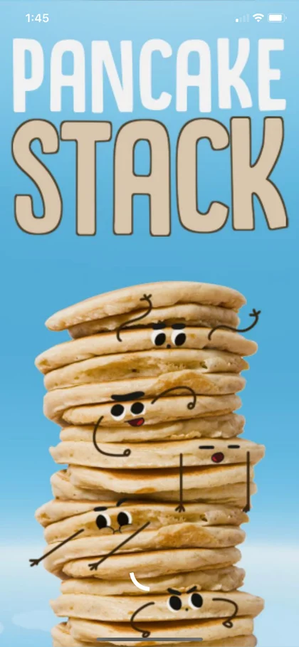 Q&AAn Oooh template that allows you to interact with your community in a Q&A format.
- Hosts and playsThe avatars are labelled as hosts, and the play count follows them.
- BookmarkSave for later stays in the top corner.
- XP under UseThe reward moves off the poster, under the action.
Early card concepts, reusable components and the final handoff.
Card Family
Q&A
An Oooh template that allows you to interact with your community in a Q&A format.
- Poster art unchangedThe original poster art.
- Title12 characters, one line. No room for a second.
- Description39 characters, then an ellipsis past 42.
- TagsCategory icons: Trending and IRL.
Handoff design, Host Discover View, Oct 2022.
CARD FAMILY
One component, six variants
One master card component powered the catalog. Three variants went into the final handoff, alongside two color explorations and an empty skeleton state.
Bookmarked
Friends replace hosts, after the play count, and Info becomes Learn More. The bookmark is filled.
Featured
Featured cards give people a starting point in Get Started. The pink surface sets them apart from the rest of the catalog.
Row_Card1, Property 1
- DefaultHandoff
- Card_
BookmarkedHandoff - PinkHandoff
- ColorVar_
1Exploration - ColorVar_
2Exploration - Variant5Empty card
Early card concepts, reusable components and the final handoff.
CARD FAMILY
Same parts, other densities
The same five card parts recombined across compact bookmark rows, parent-and-child prompt drawers, Recent cover tiles, and the Discover poster grid.
Compact row
Compact rows make long bookmark lists easier to scan, keeping the game title and Use action close together.
Parent and children
Browse reveals related games beneath the main card, so people can explore without losing their place in the list.
Cover tile
Cover tiles put the game’s artwork first in the Recent row, with quick access to saving it for later.
Poster tile
Poster tiles let people scan Discover visually. Activity and category cues add context without competing with the artwork.
Early card concepts, reusable components and the final handoff.
SEARCH
The search bar, two variants in use
Use Left and Right arrow keys to browse; Home and End reach the first and last items. You can also swipe or drag.
- Main_SearchThe entry point and search screens.
- Search W BackPushed views: View All, categories, Bookmarks.
- Bookmarks, one tap awayIn both variants, with a saved count.
- X, not CancelThe bookmarks button leaves no room for Cancel.
- 22 / 24 charactersChar 22 truncates to “...” at 24, before horizontal scroll.
Saved count
- Badge (9+), 20 saved
- Badge (1), 1 saved
- No badge, None saved
Search View
Search return
Results
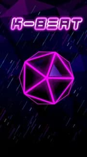
K-Beat
A fun rhythm music game
Use Left and Right arrow keys to browse; Home and End reach the first and last items. You can also swipe or drag.
- Same list cardResults reuse Row_Card1, the list card every row is built from.
- Saved state carries overA saved template keeps its filled bookmark in results.
Search invalid
Use Left and Right arrow keys to browse; Home and End reach the first and last items. You can also swipe or drag.
- Same heading slotZero Results Found sits where Results does, at the same size.
- No dead end“Discover something new” hands people back to Browse Prompts.
Handoff design, Host Discover View, Oct 2022: the search bar and Story 3, Search View. The result’s title is its poster’s template name in place of the handoff’s placeholder; its line and counts are the handoff’s design samples. The zero-results query is a neutral stand-in, and that screen is cut between its heading and message.
STATES
I designed Bookmarks across three density states: zero saved prompts, a single saved card with a recovery prompt below it, and a 20+ item list with a sticky search and sort header. The empty message also shared a component with the app’s error messages.
0 bookmarks, then Empty state
NO BOOKMARKS
FOUND
Looks like you haven’t bookmarked any prompts yet!
Bookmark your favorites by tapping the icon.
Find something to bookmark
- Text in the middleThe Content_Mid Txt component over ghost rows. The failure states below are its other variants.
- Prompt to browse“…the empty state should prompt them to browse, and have the text graphic / text sit in the middle.”
< 2 bookmarks, then Browse Prompts section
Bookmarked (1)


Find something to bookmark
- Browse prompts section“If user has < 2 bookmarks we show browse prompts section”
> 2 bookmarks, then Sticky search, count and filter
Bookmarked (20)
- Sticky above line“When user has lots of bookmarks they can scroll down. Search and Bookmarks title count + filter are sticky.”
Use Left and Right arrow keys to browse; Home and End reach the first and last items. You can also swipe or drag.
One status component, then Three failure variants
Txt_EmptyNoBookmarks, the empty state above, is the fourth variant and the only one a handoff story places. Tile labels read each variant’s name and copy. iOS and Android get separate sets with the same copy and emoji; only the emoji art differs, so your device draws its own here.
Data fails to loadTxt_TryAgain
Something
Went WrongLooks like we couldn’t load in the proper data.
Try again!OfflineTxt_InternetOffline
Looks like
You’re OFFLINESorry we couldn’t load this page.
Page not foundTxt_404
page not
foundTry searching again.
Discovery states and reusable content components.
Explore the Figma workboard and handoff
Figma file setup
Inside the Figma file, I kept rough explorations, simplified iterations, reusable components, and arrow-annotated handoff flows on connected pages so engineers and PMs could trace why a layout changed.
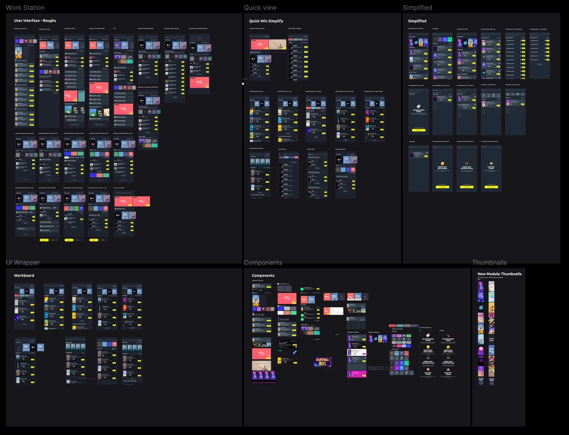
The full workboard: early roughs and layout simplifications across the top, with master components and poster assets organized below.
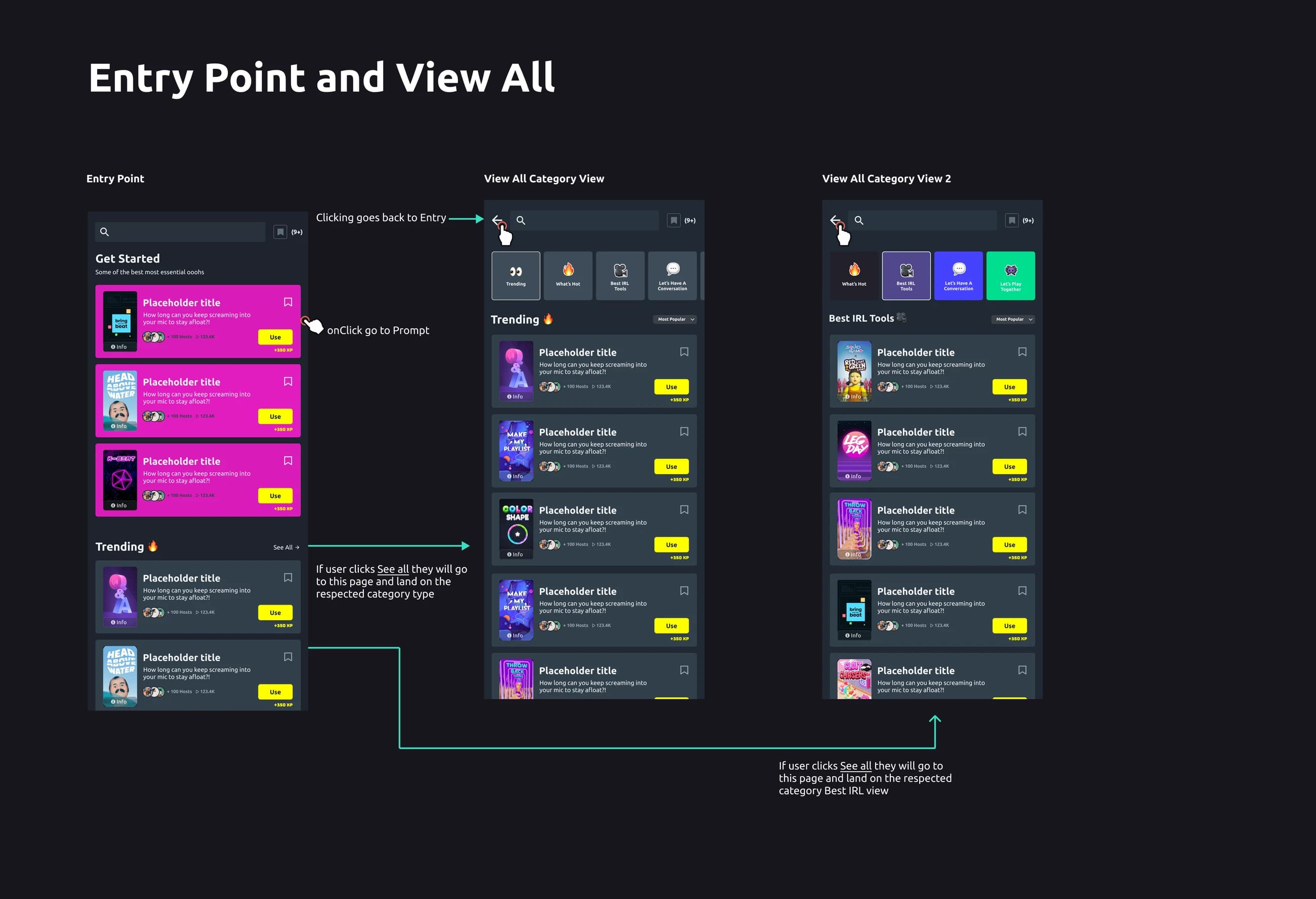
The Entry Point and View All handoff: red connector arrows and spec notes map every tap between Entry, category chips, and back navigation.
Use Left and Right arrow keys to browse; Home and End reach the first and last items. You can also swipe or drag.
Explore the sharing, creator and reaction work
Design the paths around play
Most new players arrived from a link in a creator’s Instagram bio, Twitch chat, or group thread. Sending them straight to the App Store caused instant drop-off because they couldn’t see the round they were invited to play. I designed responsive web previews that showcased the round first, paired with dismissible Open in App banners and an Android SMS waitlist with inline phone validation.
Inside the app, I designed creator profiles, submission boosting so fans could attach a note to push their video up a creator’s queue, and the verified earnings portal. For push notifications, I held the prompt until high-intent moments (following a creator, publishing an Oooh, or taking first on a leaderboard) and designed an iOS Settings recovery card for anyone who had tapped Don’t Allow.
Asking for notification permissions on cold launch trains people to tap Don’t Allow. I held the prompt until someone followed a creator, published an Oooh, or took first place on a leaderboard.
From playing to reacting
Not every moment in a group thread calls for turning on your selfie camera. In user sessions, we saw players wanted to jump into a friend’s round on the bus, in class, or late at night when recording video felt like too much friction.
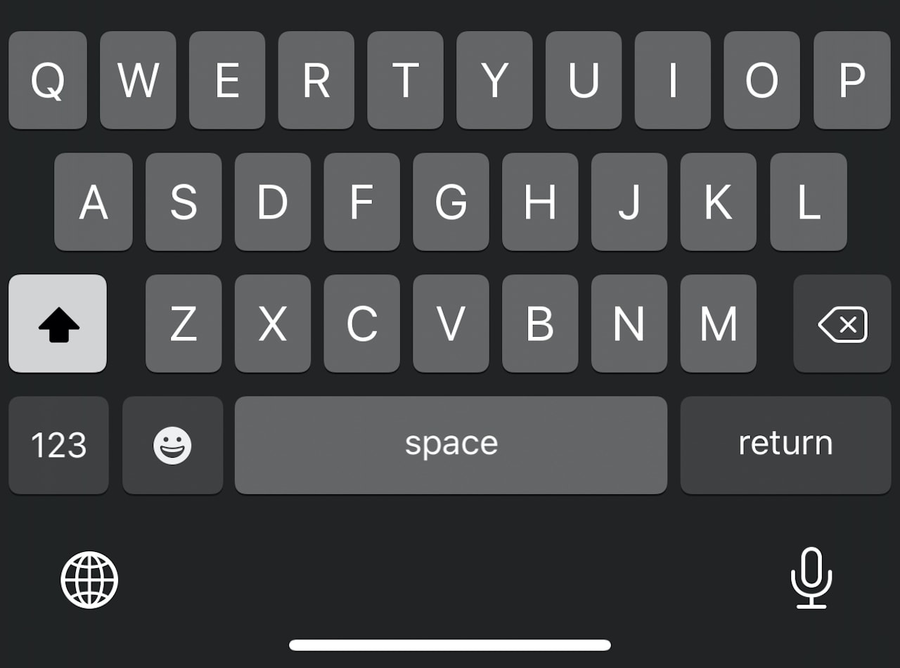
I designed Text Reacts so anyone could reply in seconds with a visual card: picking a backdrop or camera-roll photo, styling headlines above the keyboard, layering Oooh and GIPHY stickers, and posting with clear draft and error recovery.
Text Reacts
Inside the app, I designed Text Reacts so players could reply to a round with a custom card instead of a plain comment. You pick a backdrop or upload a photo, layer styled type or stickers from a combined Oooh and GIPHY tray, and post your take back to the feed.
I mapped the full authoring loop: compact and expanded sticker trays, an unsaved-changes guard when backing out, and inline toast feedback when a post succeeds or fails. For camera reactions, our user testing favored a bottom sheet where players pick whether their clip plays before the video, picture in picture, or after it.
I partnered with my PM, Charlie Helman, on the reaction and share trays so players could personalize how their clips appeared and we could track conversion from outbound deep links.
 Filters
 Sound
 Text
 Auto Trim
 React
 Upload image
Choose a background
Start with a camera-roll photo or a solid color swatch.
Make it your own
Typeface modes and color swatches sit right above the keyboard.



Add a sticker
First-party Oooh art and GIPHY share one searchable tray.
A clearer path to play
We measured the new flow in Jupyter and Tableau: more players moved from the catalog into gameplay and posting, and our D1, D7 and D30 cohorts showed higher retention and LTV. It landed well with our CEO. Oooh was later sunset and absorbed into Scopely for Monopoly Go.
If I did it again, I’d aim for better coherence and compression. I’d run tighter critiques that put the user first, and I’d audit the app and align the whole team before building the system, instead of reverse engineering it from fragments.
TEAM
Founders: Colin Carrier (former Twitch CSO) and Paco Viciana (former Disney Interactive VP). Design Director: Keely Portsmouth. PMs: Jason Donelly, Charlie Helman, Nick, and Marissa.
Thanks to Colin Carrier for taking a chance on me, and to Paco.

GALLERY
Photos from VidCon and TwitchCon of the claw machine I designed.
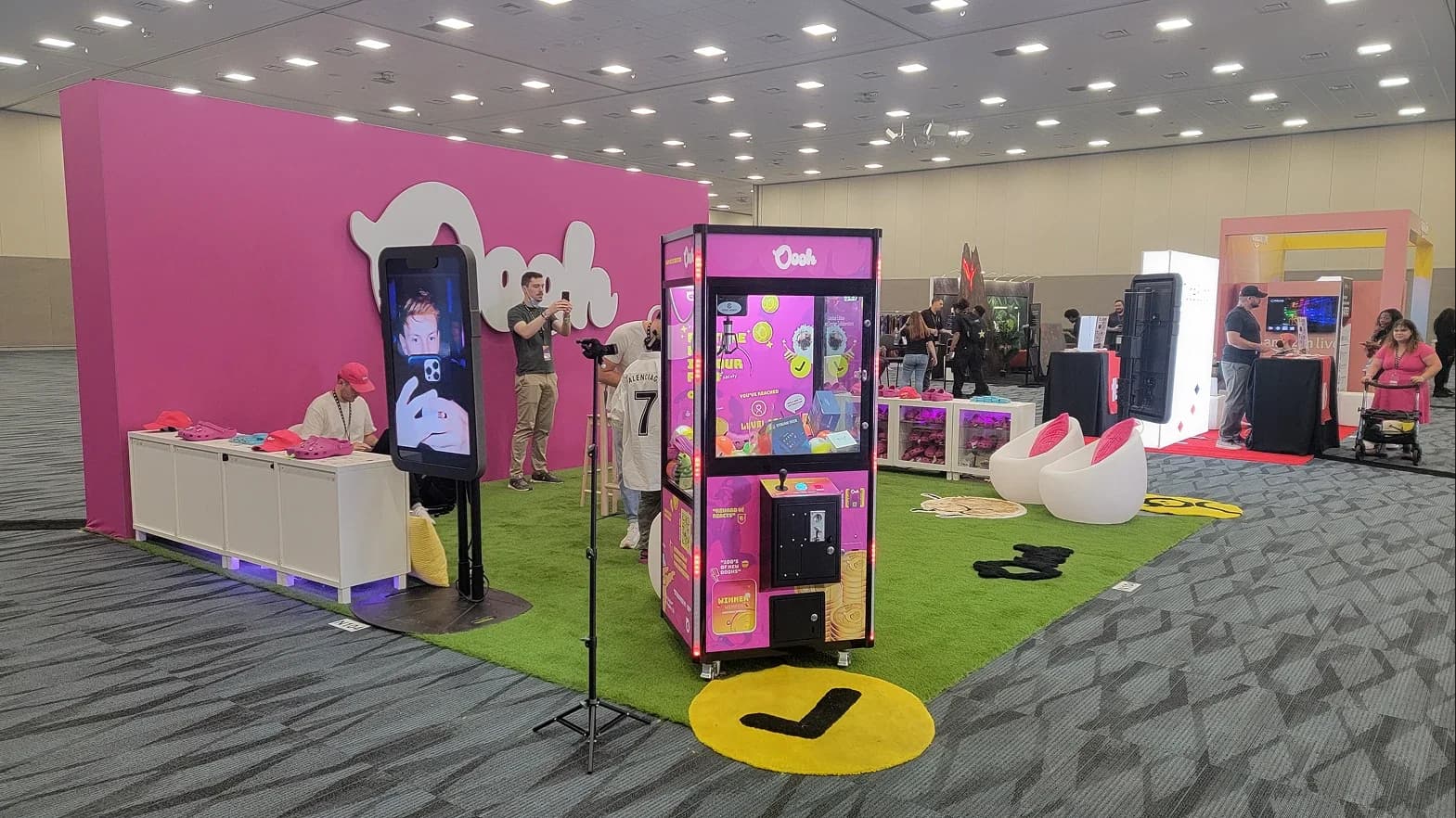
The Oooh booth at VidCon in June 2022, attended by my teammates. I designed its booth items after joining in May.
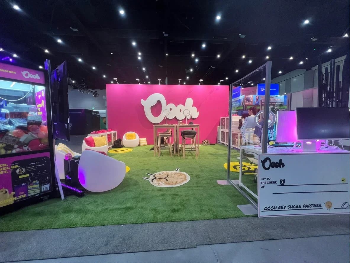
TwitchCon 2022: the same booth, with the claw machine, the lounge and the Oooh rev share partner check.
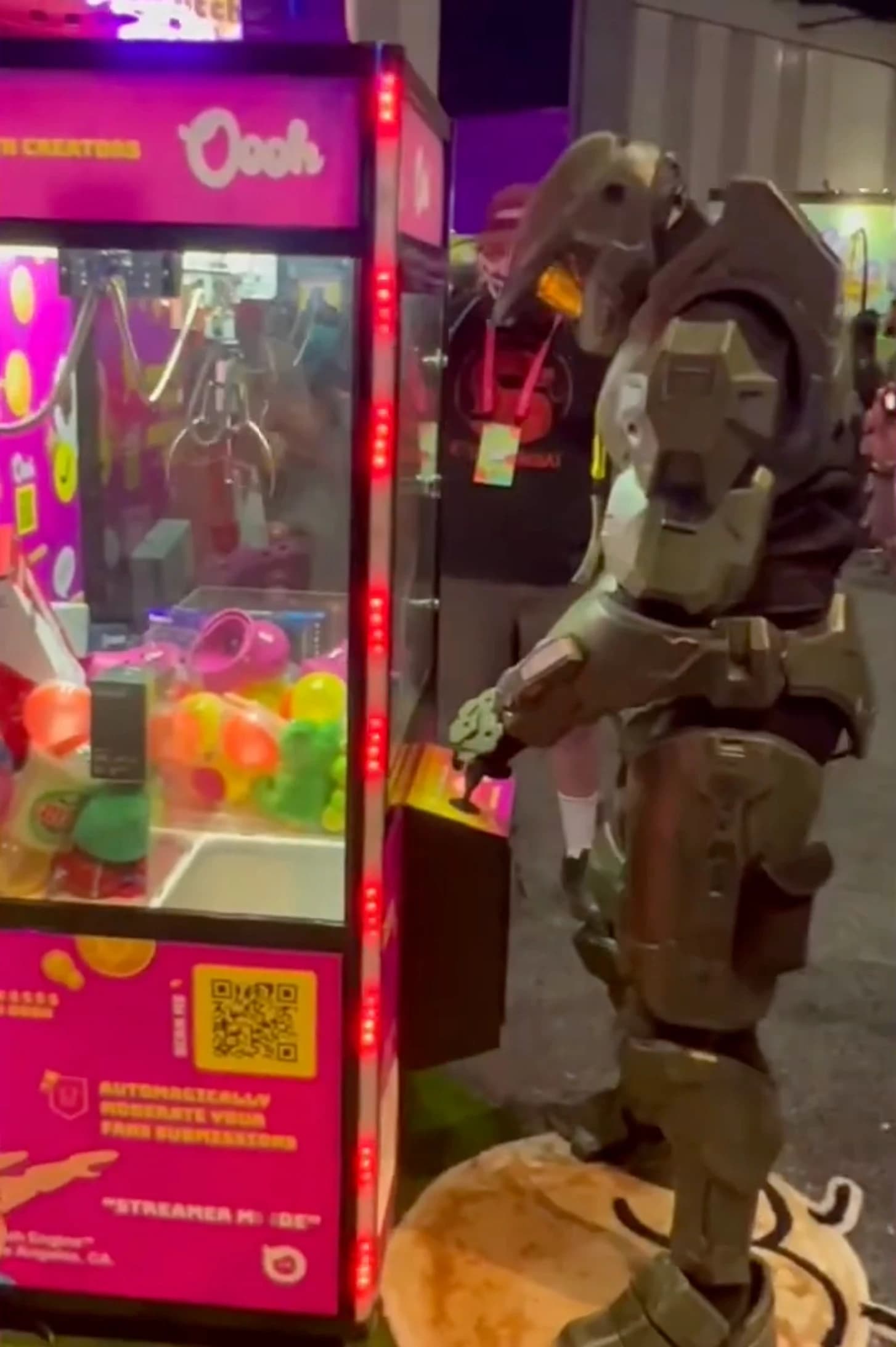
Master Chief at the Oooh booth with the claw machine I designed in Figma.
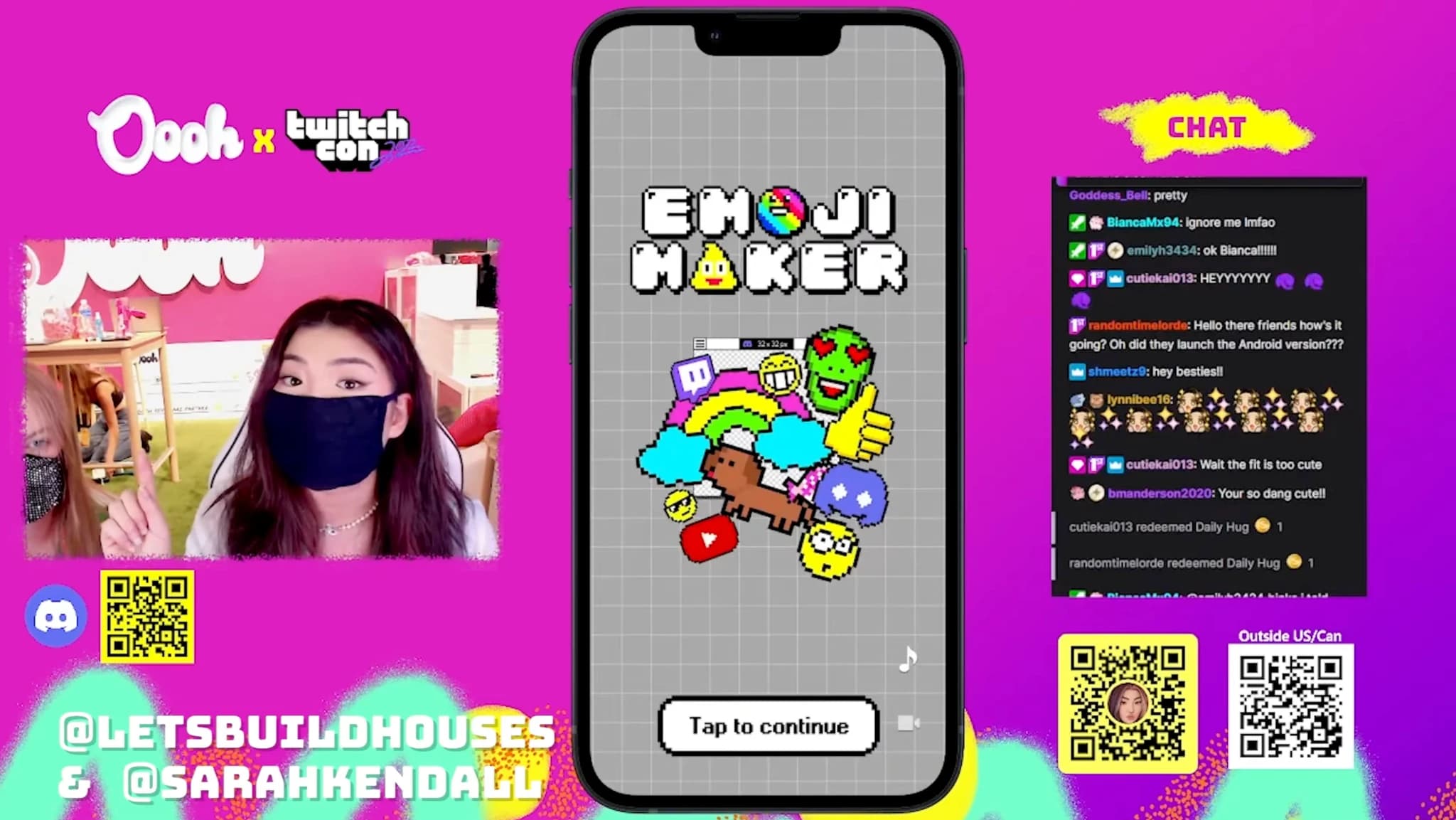
Oooh at TwitchCon: Emoji Maker on stream.
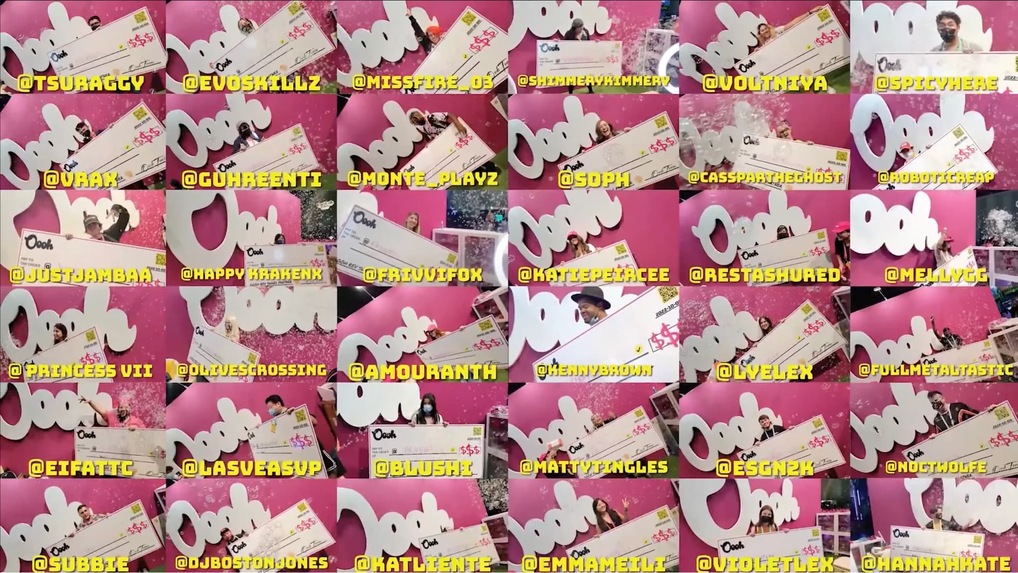
Creators at the Oooh booth.
Use Left and Right arrow keys to browse; Home and End reach the first and last items. You can also swipe or drag.
ABOUT
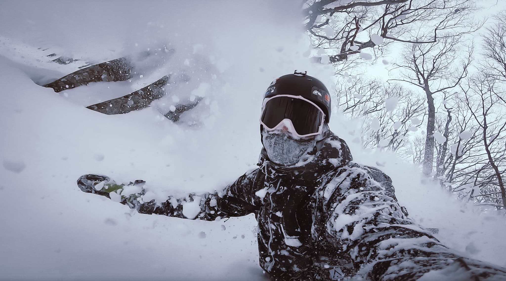
I’m Matt Stenquist, a Product Design Engineer and former professional snowboarder. I started coding at nine, shipped modded hardware and games by 16, and turned pro by 22. A few broken bones and a gold tooth later, I design and code consumer apps, Figma component systems, and AI developer tools from scratch.
LEARN MORE